Design System · Mamo
Blaze Design System
Blaze is the design system every Mamo product is built on, and I have owned it from both sides: first as the engineer who wrote its code, now as the designer who owns its Figma source. It's the throughline of my entire time at Mamo, and the reason a Product Designer ends up being called the design systems lead.
The challenge
A design system is easy to start and hard to keep honest. The real challenge with Blaze was continuity: owning one living system as I crossed from engineering into design, while the company, the team, and the tooling all changed underneath it. The code side had to keep carrying the system forward without breaking what engineers had already built on it.
And because I built and shipped that code before I owned the Figma source, I carry a constraint most design systems designers don't: I know exactly how a system breaks in implementation. The Figma decisions have to survive contact with the codebase, not just look right in a file.
How I approached it
Both sides of the system
A design system has two sides: the Figma source and the code that implements it. I have owned both.
As an engineer in 2021, I built Mamo's first reusable component library from scratch in SCSS. Nothing reusable existed before it. It saved the engineering team 7-10 hours a week. From 2022 to 2024 I re-platformed onto Storybook and Material UI, aligning design and development one to one with developer experience as a first-class concern.
When I moved into design I crossed to the other side and took over the Figma source, reducing variants for consistency and speed, documenting the full system. Most people own one side of this contract. I have owned both. That’s why the design decisions hold up in code.
Component architecture
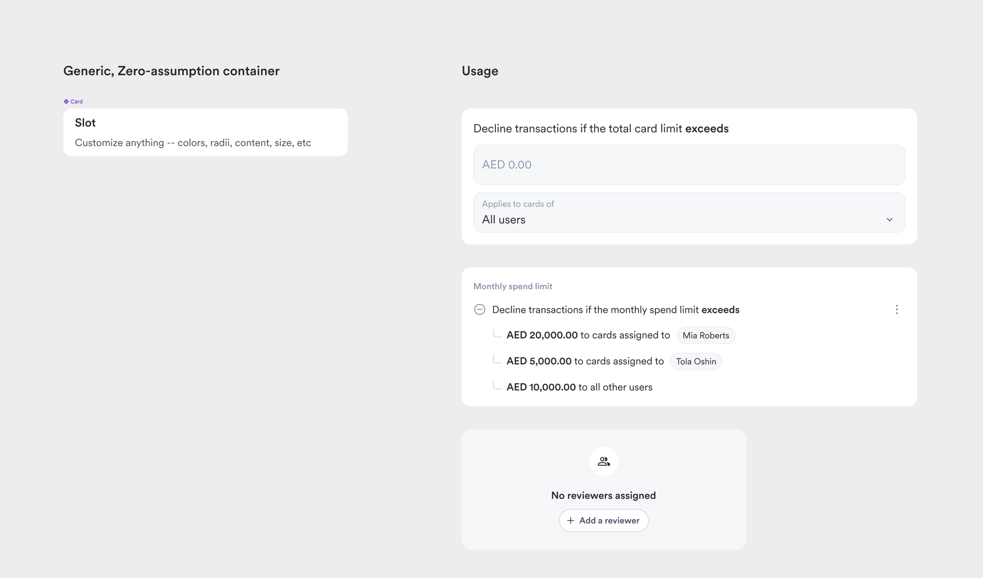
I architect components to be reused, not just drawn. Blaze runs to 140+ components today, and the clearest example of the approach is the Card: I scoped it to a zero-assumption container with a single content slot and no style variants.
Feature-specific layouts belong in local components, not in the system. Padding lives in whatever consumes the card. Visual properties are instance overrides. The alternative is a variant graveyard nobody wants to maintain.
The token layer works the same way: semantic tiers for identifier, status, and brand. A new color has a place to live before anyone asks for it.
Making changes visible
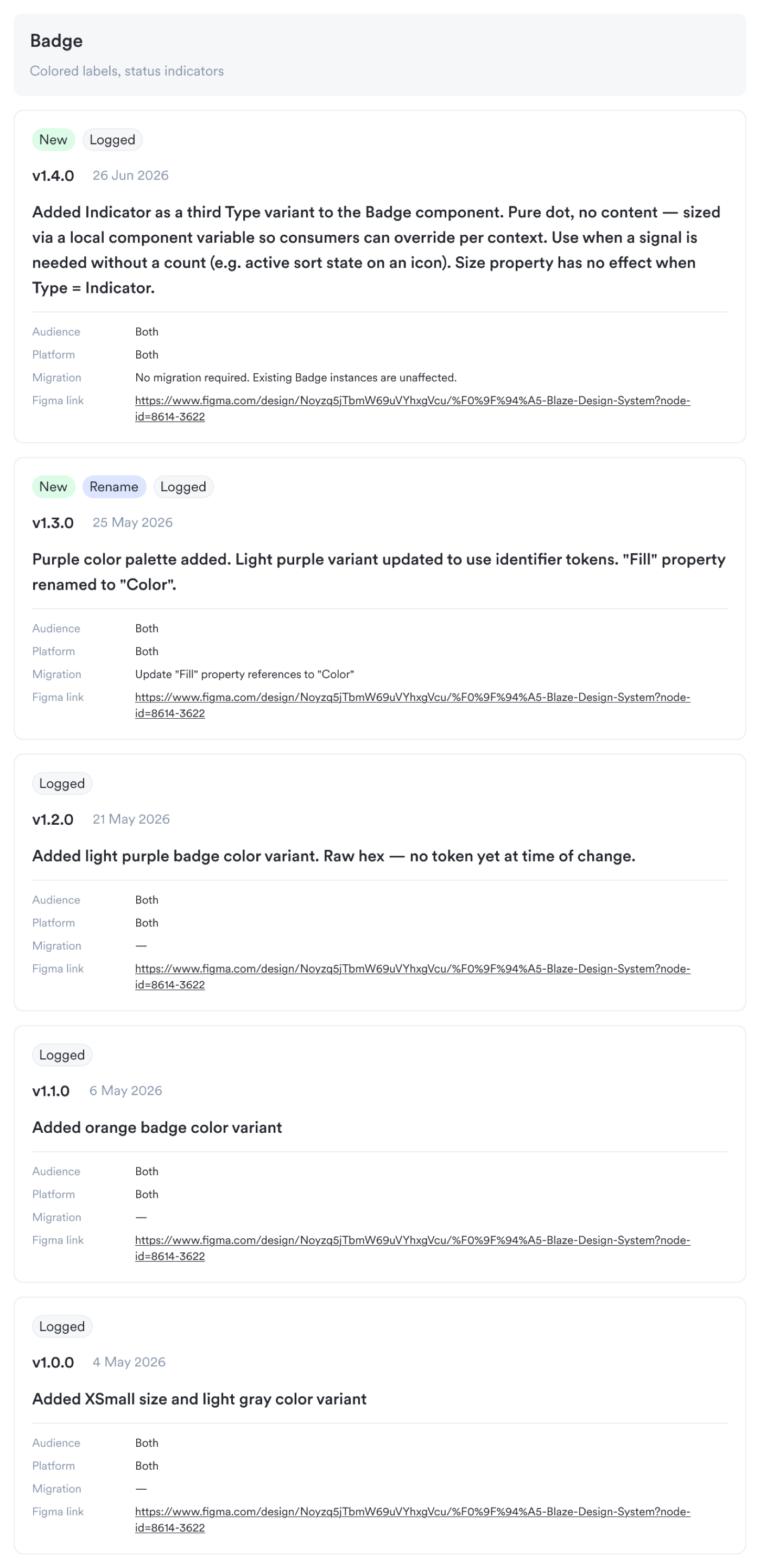
The system had a quiet failure mode. I would publish a change, tag the engineers in a Figma comment, and the comment would get missed. Figma comments are pull, not push. Over 80 published changes piled up with no reliable signal of what actually changed or what needed migrating in code.
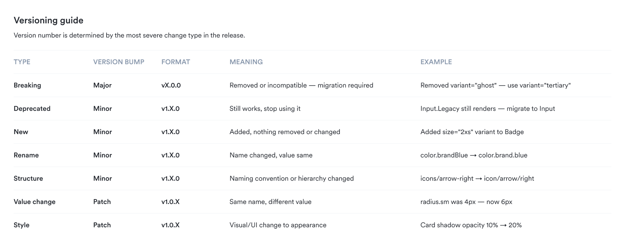
I researched how other teams handle this and designed a changelog system. Figma holds the permanent record. When a change needs engineering work, it files a ticket straight to the right engineer in Linear.
The CPO reviewed my first design and cut it down. That simplification made it better. Knowing what to remove is part of the work.
Documentation at scale
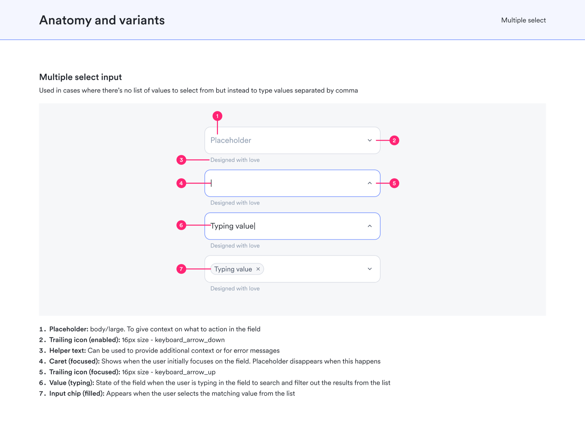
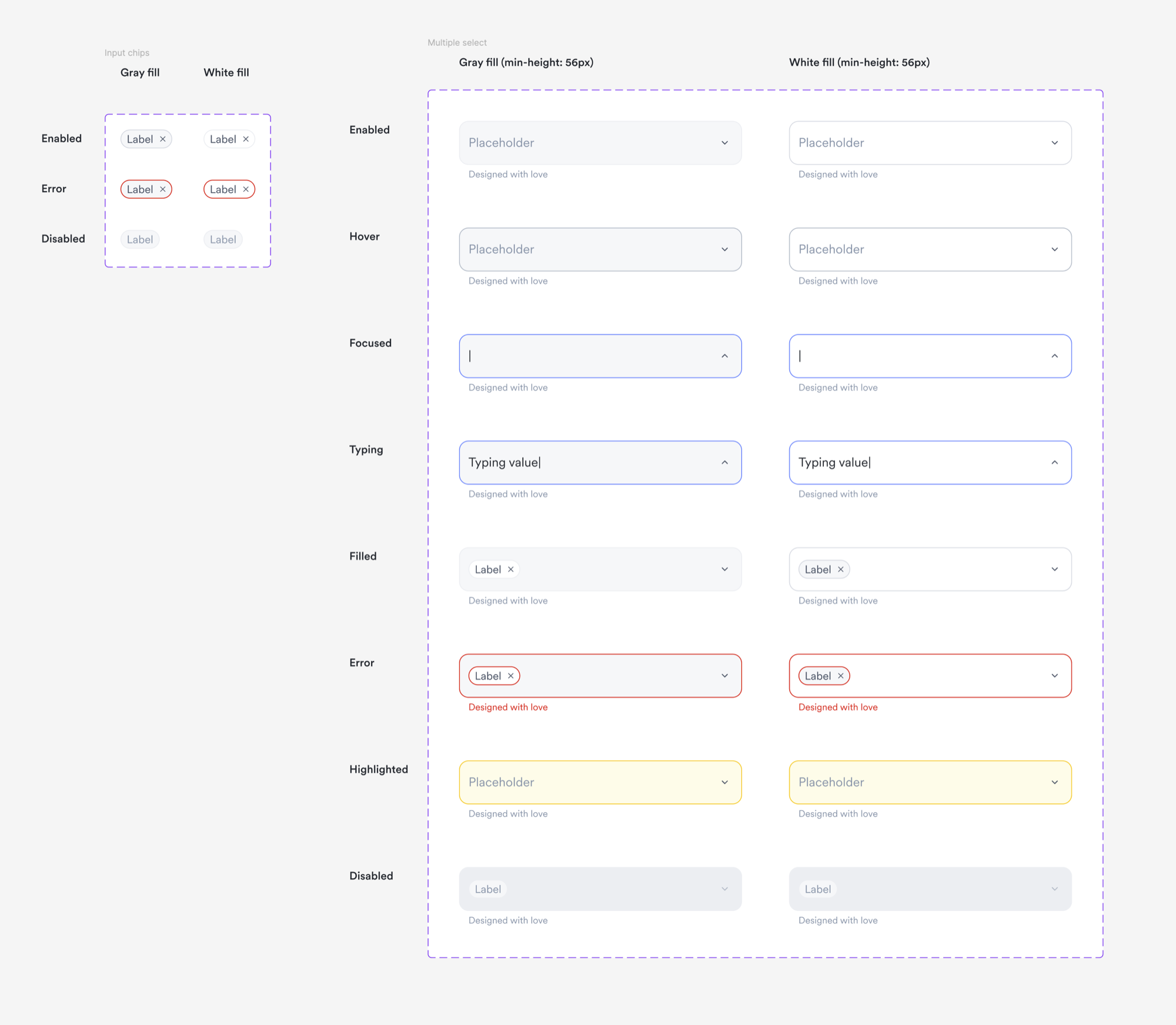
Most components had no inline documentation. Engineers were guessing at intent. Designers had no reference. I set a five-frame standard for every component: overview, anatomy and variants, sizing, theme, and usage.
I hand-documented the highest-traffic components first to set the quality bar. Then I extended the library with AI assistance, where my job becomes the review layer.
The agent gets the structure right but it doesn't know the Mamo-specific reasons a component was deliberately constrained. That context comes from having built and shipped the code.
What came of it
More than the artifacts, it's proof of a specific kind of range: I've owned the same design system from both sides, the code as an engineer and the Figma source as a designer, from Design Engineer to Product Designer across 5+ years. Still the person the team points to when something needs to be true everywhere at once.
Reflection
Still growing
A design system is never finished. It grows. Being honest about its limits is part of owning it. Blaze is light-first today: no real dark mode yet, and proper theming is still ahead.
I'm defining Blaze's first formal motion language, validated against real product features rather than invented in the abstract. I'm running an evaluation to move the icon set off Material Icons onto something that matches where the system is heading.
The next question is open too: what the system looks like when AI tooling can read and extend it directly.
What I would do differently
If I started over, I would invest in a proper token naming convention before building components. The system works, but the token layer carries scars from decisions I made early when I did not know how big it would get.
Dark mode would be easier to add if the color tokens were structured for it from the start. Same for the icon set. Material Icons was the right call in 2021, but migrating off it now is harder than choosing a better option would have been.