Web Dashboard, Mamo, 2025–2026
International payouts
A payout is a bank transfer: money moves from a merchant’s AED payments account to someone else’s bank account. The brief was to add international payouts. Before that, the local payouts flow needed fixing, so I redesigned it as one form and then made the same form work for transfers abroad. I designed the flow and the forms, and we landed on the decisions together over several design reviews. The first merchant payout went out in September 2026.
- Sep 2026
- first merchant payout
- 4
- groups of countries, one recipient form
- Seconds
- for a payout to reach a UK bank
The challenge
Adding international payouts wasn’t the whole job. We had to fix the existing payouts flow first, and then keep the same structure and patterns working for transfers abroad, without the two feeling like different products. It had to be one form that adjusts to where you’re sending.
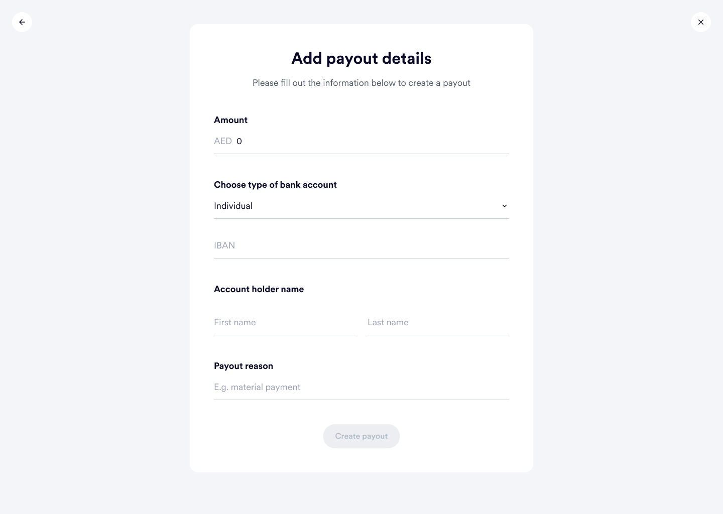
The old flow asked how you wanted to create the payout before it showed you anything else, manual or bulk. Then you typed the amount, the type of bank account, the IBAN and the account holder’s name, every time. There were no saved recipients. International made that harder. Each country needs different bank details, and for the first release there was no bulk payout abroad, although local payouts have one.
How I approached it
The mess before the spec
This wasn’t only me. The four of us, Joharah, Asma, Tola and I, brainstormed the solution together: what the future of payouts should look like with international payouts in it.
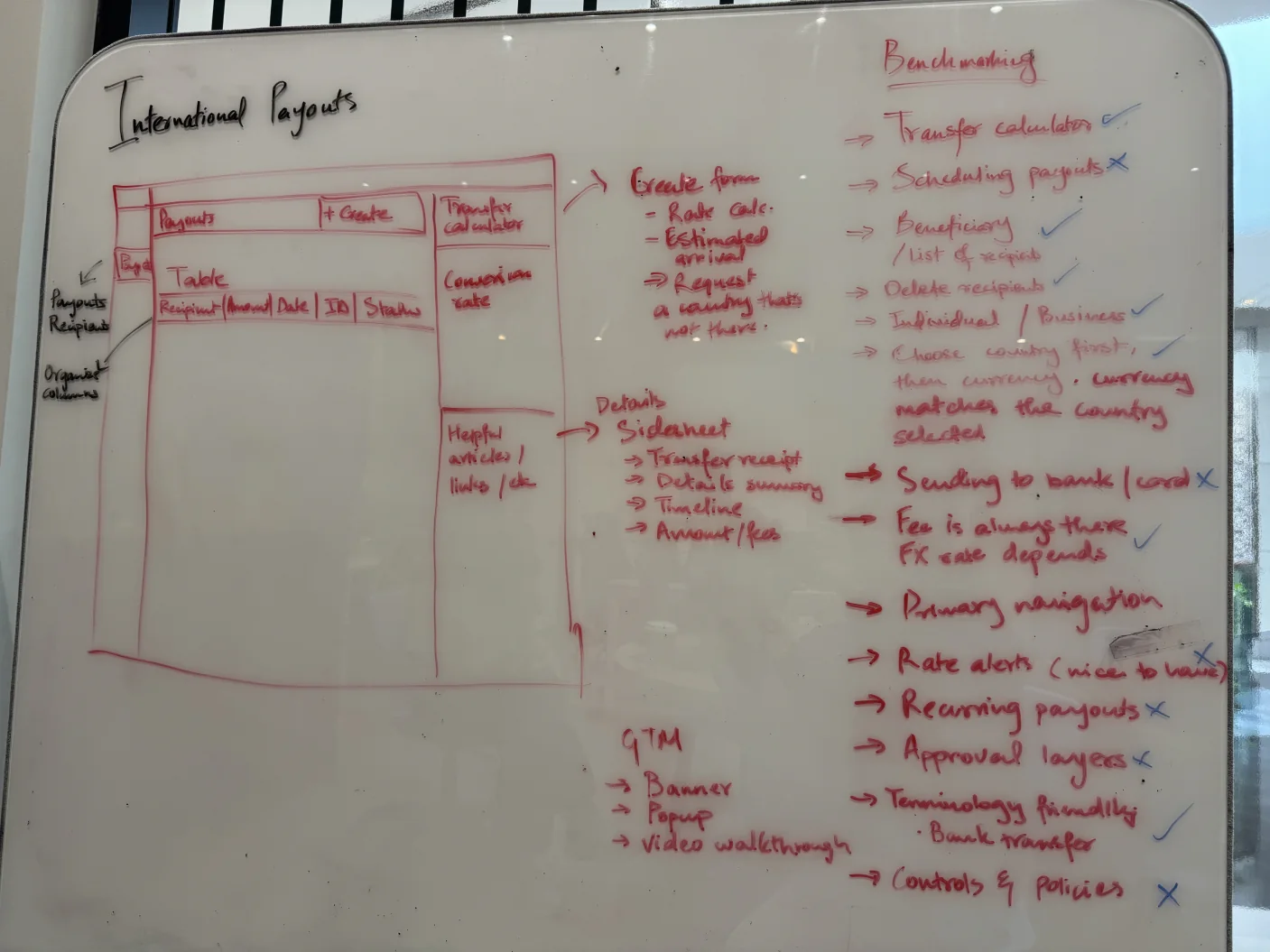
I started on a whiteboard. I sketched the payouts page with a recipients tab and a column on the right for a transfer calculator and the conversion rate, then wrote a benchmarking list down the side: what other transfer products do, ticked if we’d do it and crossed if we wouldn’t.
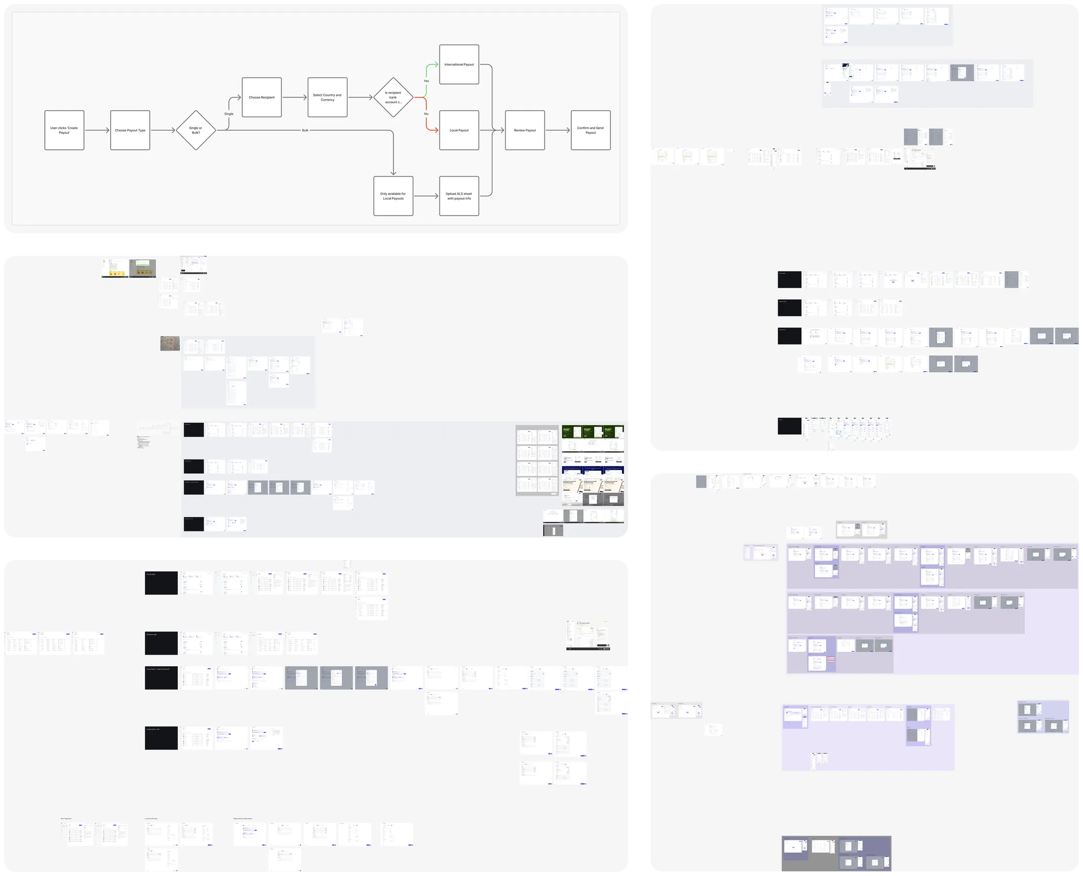
In Figma I wrote the branching down as a flow chart: single or bulk, then local or international, decided by the country and currency of the recipient’s bank account. Then I laid the form out in the playground, page after page. It was mostly direction: styling, placement, layout, the information architecture. A lot of trial and error.
One form, no help panel
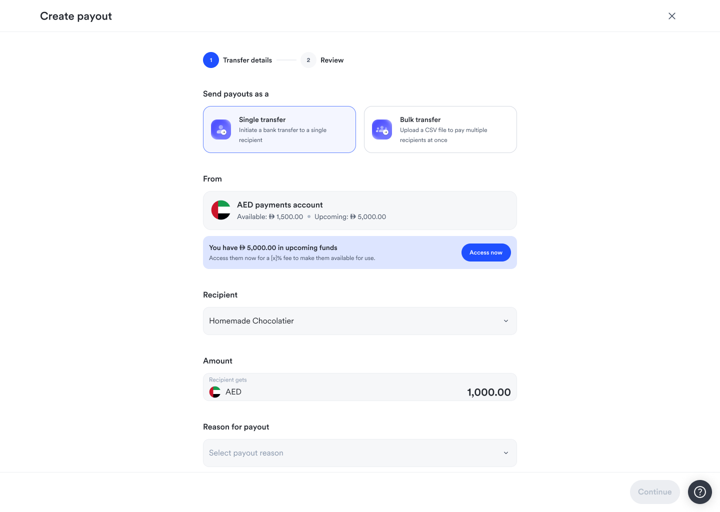
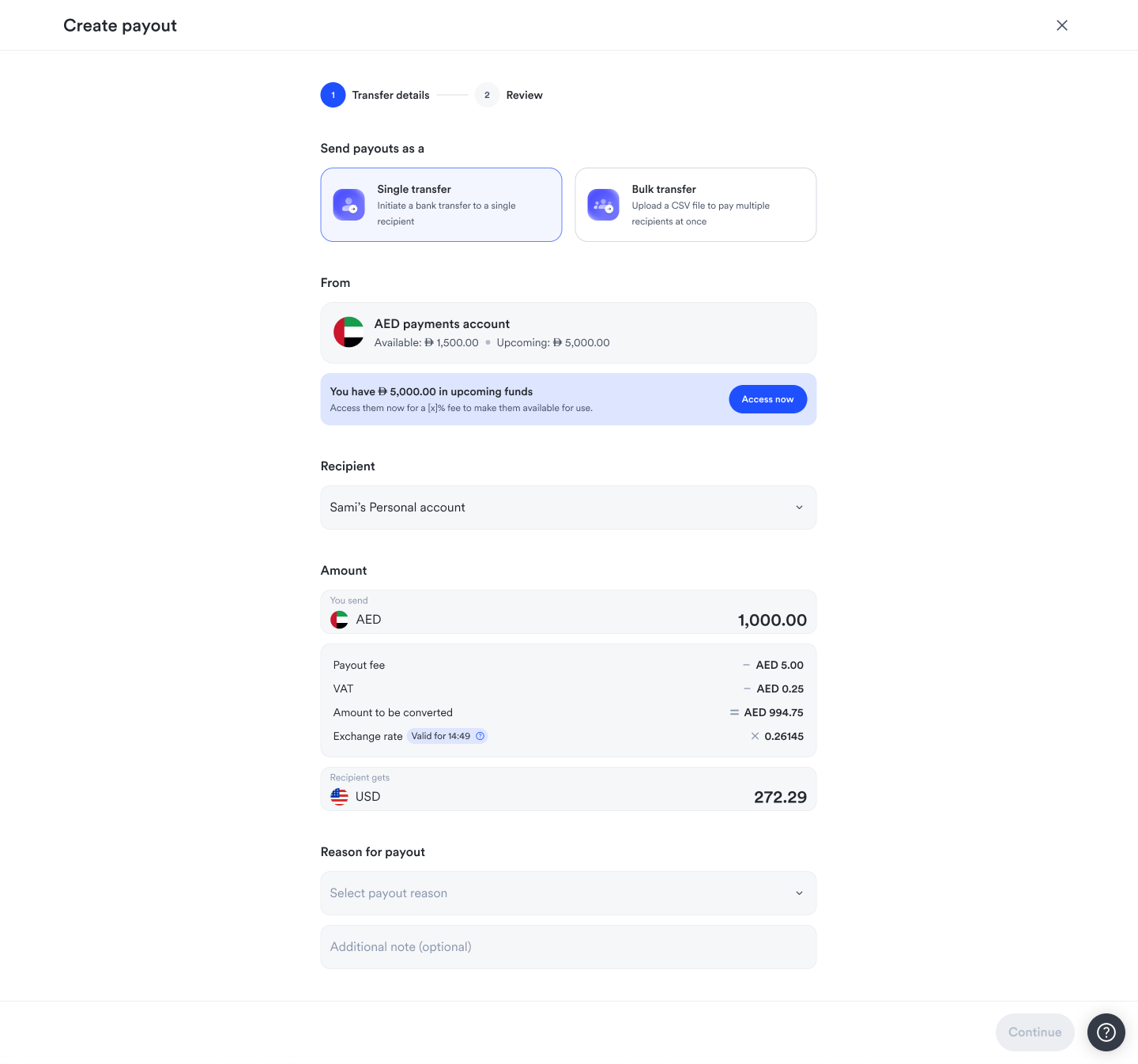
Some forms hide the next step until you click, so doing anything takes several clicks. Before the redesign we’d always had a single form, but I tried both ways for payouts. In one version two choice cards sat at the top of the form, single or bulk, always there, with one already selected. In the other, those cards were the first step, and you saw no fields until you answered the first question: single payout or bulk?
We went back and forth, and landed on one form with as few clicks as possible. Most merchants send single payouts, so single is selected for them, and that’s one less step to create a payout.
We also tried a help section on the right side of the form, and I asked what it was there to explain. If a form needs a panel to explain it, the user ends up reading a manual for something that should be obvious to use. We dropped it.
Recipients with nicknames
Recipients are saved, so you pick one instead of typing their bank details again. Each recipient has a nickname. Two recipients can have very similar legal names, and a merchant may not remember someone by their legal name at all. They remember them by what they call them, which is how they’ll look for them when they need to make a payout. So the choice is theirs, and the nickname field sits below the name in the form.
Type the amount in either currency
The merchant sends AED, but they might want to pay someone USD 300. They shouldn’t have to keep changing the AED figure until it matches. They type 300 in the recipient’s field and get the AED amount, or type AED 3,000 and see what that is in the recipient’s currency. Users are busy and don’t have time to pick up a calculator, so the form does the math.
Under the amount, the form shows the payout fee, VAT, the amount that gets converted and the exchange rate. The rate has a timer on it, and the badge turns red when the rate is about to expire.
Many countries, one pattern
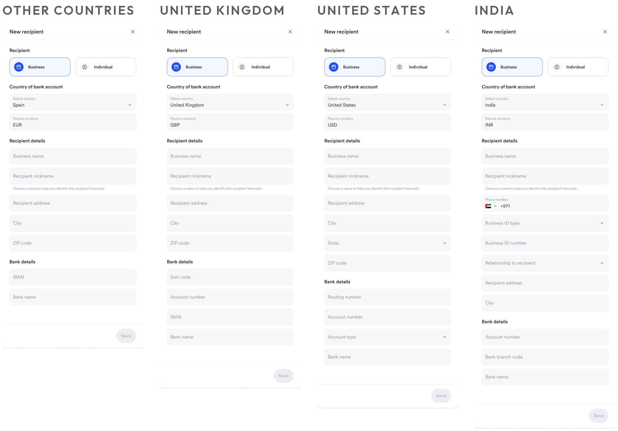
The essence of the form is the same everywhere: who the recipient is, individual or business, and their bank details. What changes is what our payout provider requires for each country. So the work was learning which fields they require, which fields we should ask for in turn, and which we can pre-fill from what we already know. A country can need many more fields than we ask the merchant for.
I built it from blocks, so it’s modular. Anything entered shows up on the review step, every field is easy to describe, and a new country mostly means putting the same fields in the right order.
Errors next to the field
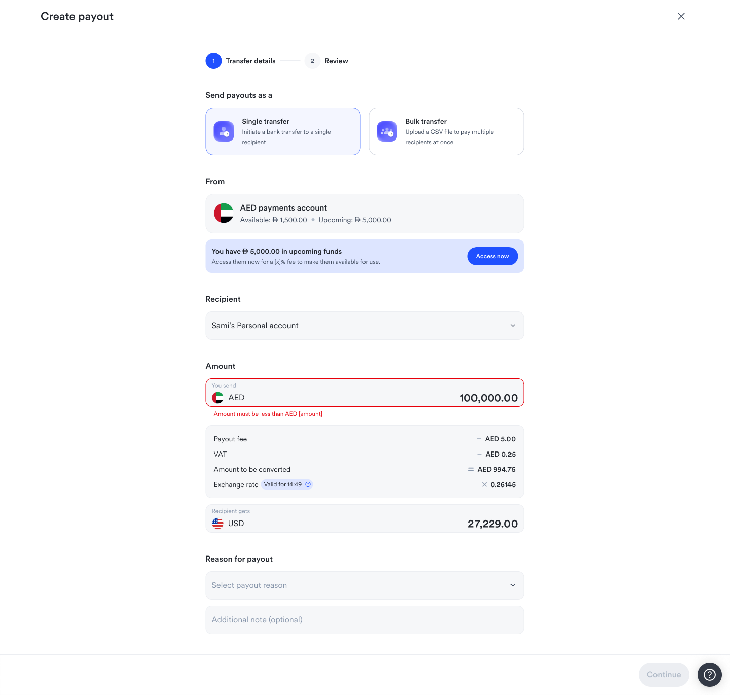
There are two kinds of maximum. One is a limit on how much you can send in a single payout. The other is the balance in your AED payments account. The error shows inline, under the amount, because that’s where the user is working. Why make them look to the top right of the screen for a snackbar when the field can say what’s wrong?
What came of it
The first merchant payout went out in September 2026. Payouts reach a UK bank within seconds.
The same payout form handles local transfers and transfers abroad, and the recipient form is the same across countries, with a few extra fields where a country needs them. I designed the recipient form for four groups of countries: the UK, the US, India and everywhere else. Bulk payouts stay local for the first release.
Reflection
What I’m proudest of
That the design will scale for future features. The payout form and the recipient form work like plug and play, so the designs aren’t complicated and we won’t need another redesign. The future thinking went into them from the start.
What I would do differently
Account for the maximum amount from the start. It applies to the AED amount, and I hadn’t designed that edge case. I’d design that state in the first pass, for local and international.