Mobile App · Mamo · 2025-2026
Mamo App
Mamo's merchant app ran on web views since day one. The native migration took four flows built for a dashboard and redesigned them for a phone, each with different layout constraints, different interaction patterns, and users moving fast and context-switching constantly. Payments list and create payment link shipped first. Mamo Card followed: full native card management as a hard prerequisite for Apple Pay. Expense transactions merged two separate features into one table on both dashboard and app.
The challenge
Each flow had a distinct constraint.
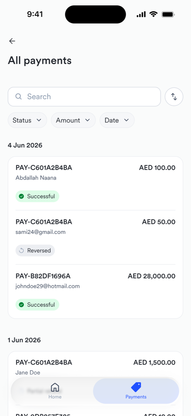
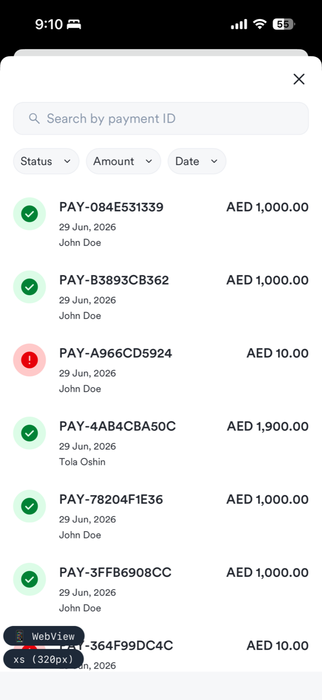
- Payments list: GA4 showed 64% of sessions scan the list and leave without opening a single detail, and 43.7% of users who open a payment detail go directly to another detail, not back to the list. Row legibility was the primary design job.
- Create payment link: the web flow was three steps. On mobile, three steps for something merchants do constantly is too many.
- Mamo Card: Apple requires a fully native card management experience before they allow Apple Pay. The native experience was a hard gate, not a nice-to-have.
- Expense transactions: one card swipe created two records in two separate places, and users had to mentally map between them. The backfill feature gave expenses the wrong dates, actively confusing people.
How I approached it
Payments list
Two parallel design streams, both feeding into the same review cadence. Payments list first: scoped the key decisions — what goes in a row, what's filterable, how statuses get humanified, where disputes live. Then a design review to lock the structural calls, then a working session to settle disputes structure, badge design, and empty states.
The disputes data model turned out to be separate from payments, not a filtered view. It got its own nav tab, its own filter set, its own status vocabulary. Getting that separation right early prevented a merged-view compromise that would have been wrong for both data models.
Create payment link
Designed three full flows: one-step, two-step, three-step. Pressure-tested them in a working session the day before the team review, then brought all three to the cross-functional group to decide. One-step won — fastest, fits mobile usage, avoids wizard overhead.
The debates that followed were about not boxing ourselves in later: how do you design customer info fields today when you know more fields are coming? The answer was a drawer, a scalable multi-select instead of checkboxes. How do you make processing fees feel intentional? Don't make it a toggle. Make it an explicit add.
Mamo Card: native cards and Apple Pay
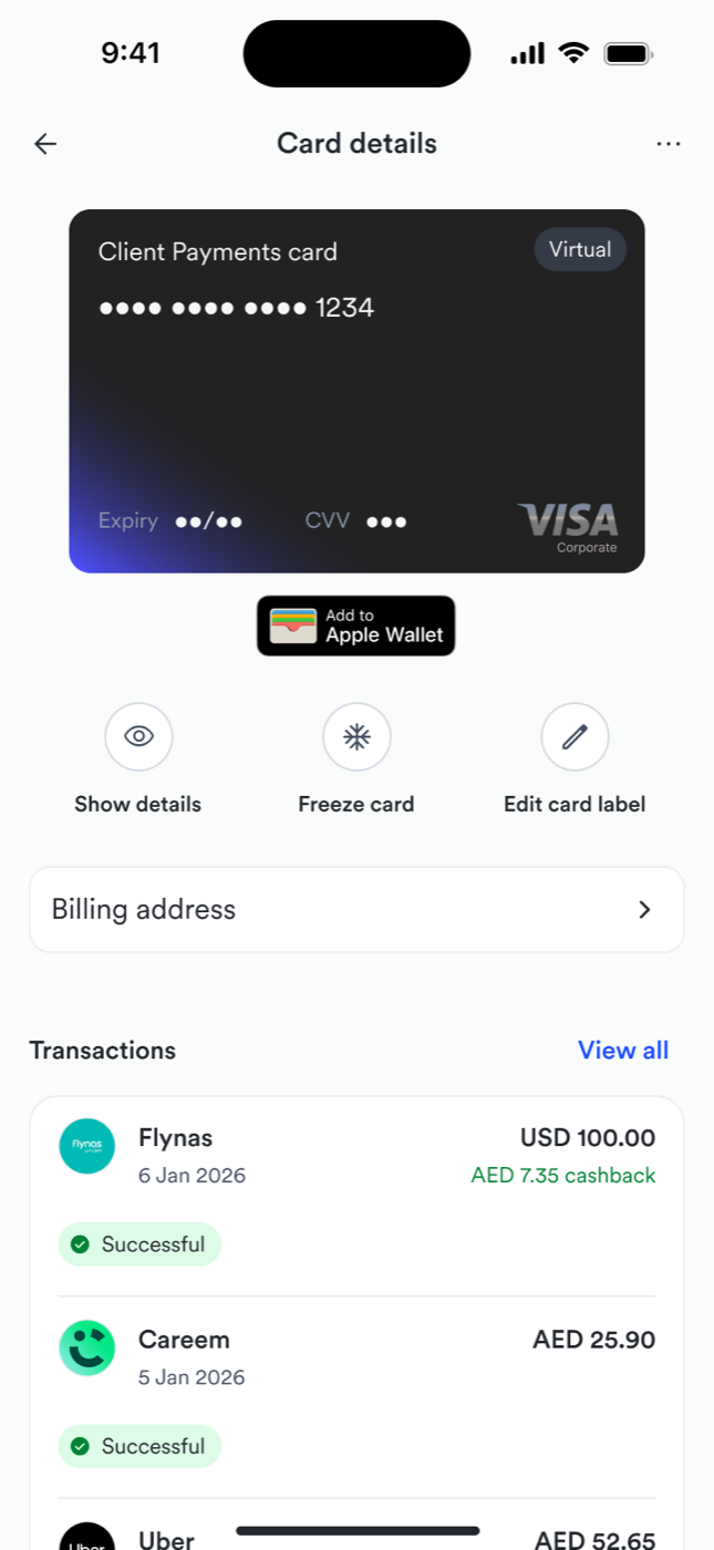
Before this project, Mamo Card had no native mobile experience. Card management was a web view inside the app. That created a hard blocker: Apple requires a fully native cards experience before they allow in-app Apple Pay provisioning. Without going native, Mamo could not ship Apple Pay.
I designed two separate user roles: Card Admin (issuance, limits, card states) and Cardholder (view, freeze, cancel, Apple Pay). Four card states: active, inactive, frozen, cancelled.
The Apple Pay provisioning flow was designed in parallel with the rest of the card experience, not bolted on after. The timeline was driven by Apple's gate, not internal roadmaps. Shipped in app v3.2.7 on May 30, 2025. Apple Pay was unblocked the day it went live.
Expense transactions: one thing, one place
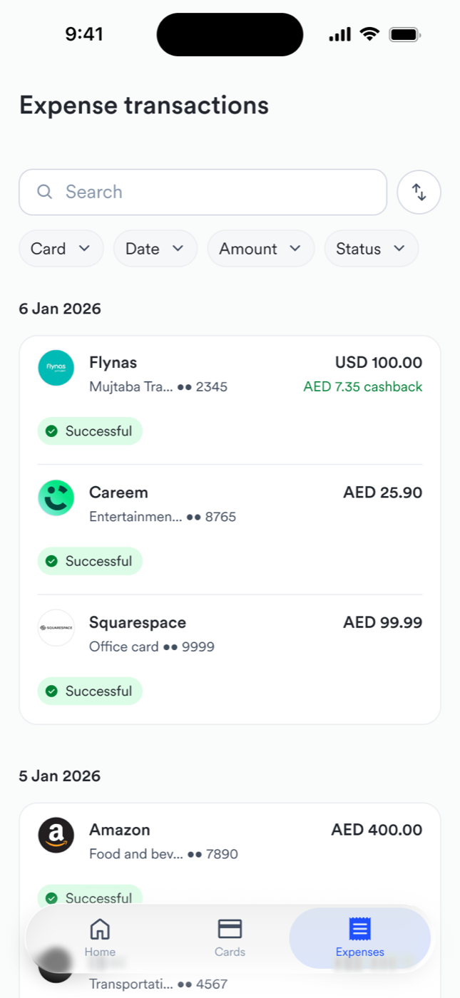
Mamo Card had two concepts born from the same card swipe that lived in two separate places. Transactions held raw financial data. Expenses held the metadata: receipts, categories, descriptions. Users navigated between two sections to manage one event.
Real bugs told the story: descriptions not saving, wrong dates from backfill, a submission screen that triggered an infinite open-close loop. The conceptual split was so deep that engineers mixed up status and accounting status mid-build — we had to rename APIs to stop the confusion.
Asma drove the merger proposal in October 2025 after users reported the backfill behaviour as a bug. The team chose to strip scope to ship: no reviewer hierarchy, no disabled states, no flag as incomplete, all deliberately deferred. Shipped April 7-8, 2026 across both dashboard and app.
What came of it
Four native flows shipped across two major releases.
- Payments list: search expanded to customer name and email, date headers sticky while scrolling, 8 payment status labels humanified, disputes moved to its own nav tab with orange badge.
- Create payment link: one-step layout, 'add fee' pattern for processing fees, customer info in a multi-select drawer, 'link ready to share' success screen.
- Mamo Card: PAN and CVV reveal, freeze/unfreeze, cancel, activate physical card (dark UI + QR scan), Apple Pay shipped alongside Google Pay and Samsung Pay on Android.
- Expense transactions: unified table across dashboard and app, customizable requirements per submission, dedicated Accountant Hub, full GTM with email, help center, YouTube walkthrough, and LinkedIn post.
Every payments-list decision maps back to the GA4 behaviour that opened the project: legible rows grouped by date for the 64% who scan and leave without opening a detail, and fast detail-to-detail movement for the 43.7% who never return to the list. Whether those numbers moved is what I measure next.
Reflection
What I would do differently
I designed the payments list and create payment link in parallel, but disputes landed in a separate sprint. If the data model exploration had happened a week earlier, disputes could have shared the same review cadence instead of being retrofitted into the nav architecture. The orange dot on a separate tab works, but a unified notifications model would have been cleaner.
Next native migration, I scope the full data model before touching a single Figma frame. For expense transactions, the API naming confusion would have been caught earlier if I had reviewed the implementation naming against the design layer spec before build started.